How I Spend My Typical Day:
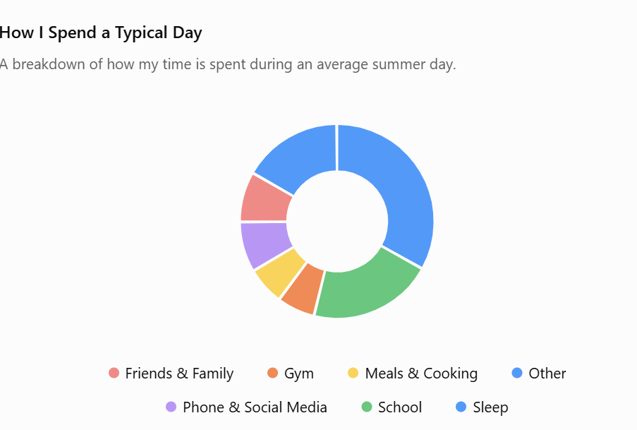
For this Daily Create, I wanted to visualize how I spend a typical day. Breaking my day into categories helped me see where most of my time goes. I found that presenting the information as a pie chart made it much easier to see the balance between different activities than just listing them out.
I kept the visualization simple by only including the major parts of my day, following Mayer’s Coherence Principle, by making sure there was no unnecessary information. I also used clear labels and a descriptive title to follow the Signaling Principle making it easy to read the chart.
My Weekly Exercise Routine:
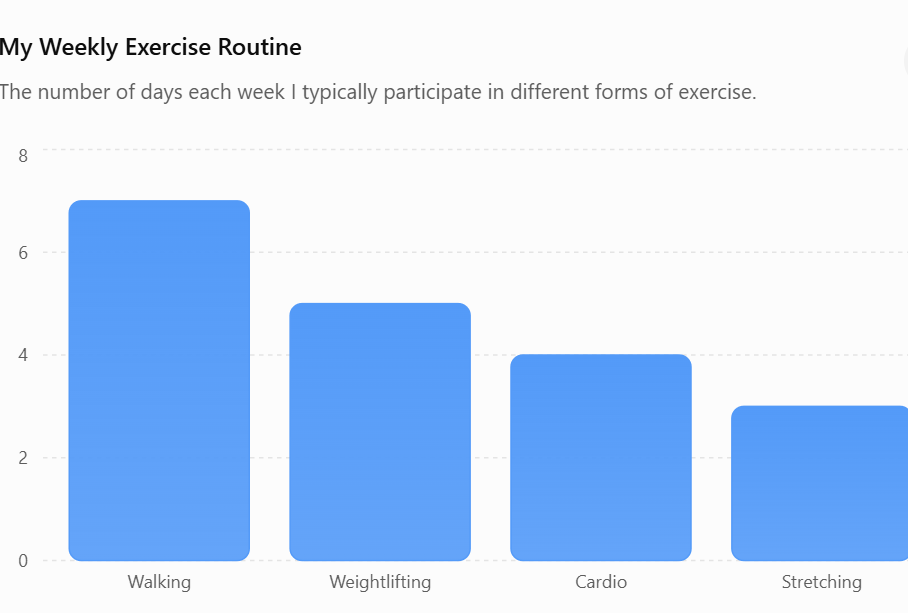
For my second data visualization I made a bar chart showing how often I participate in different types of exercise throughout the week. I found the bar chart makes it easier to compare each activity. Looking at the graph it shows that weightlifting is the main focus of my workouts but walking is the activity I do most consistently.
I also followed Mayer’s Coherence Principle by keeping only four categories and avoiding unnecessary details and the Signaling Principle by using a clear title and labels so viewers could easily understand the information being shown.
My favorite activities ranked:
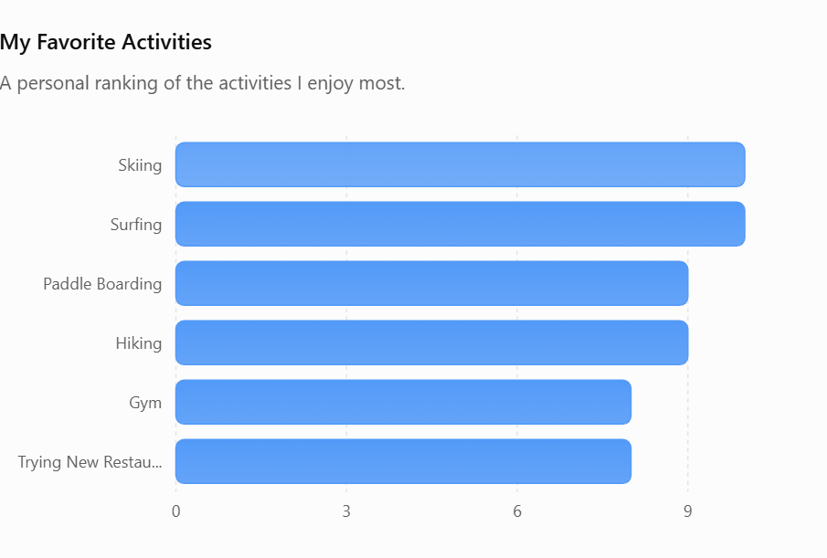
For this daily creation I ranked some of my favorite activities based on how much I enjoy them.
While creating this graph I followed Mayer’s Personalization Principle by using information that is meaningful to me. I also applied the Contiguity Principle by making sure the graph was simple and easy to read.
Leave a Reply
You must be logged in to post a comment.